Navigate Dashboards

This topic explains the tools and techniques available to help users navigate through HHAeXchange Dashboards.
This document pertains to HHAeXchange Dashboards created for release in December 2022 and later. For information on navigating dashboards created before that time, see Navigate Classic Dashboards.
A Dashboard is a collection of components (cards, widgets, and filters) that allow you to visualize and measure key performance indicators (KPIs) from a central location. Information is organized according to business function or category (for example, Authorizations, EVV). The user can view metrics and analyze data from a high level down to specific detail.
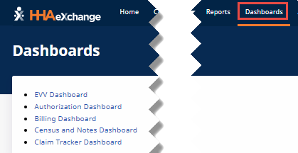
The Dashboards available to the user can be found on the Dashboards menu in the HHAeXchange application’s top navigation bar.

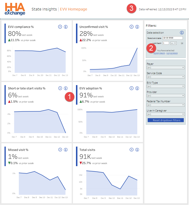
Every Dashboard opens to an overview Homepage. The Homepage is made up of cards (at left, 1) presenting high-level informational charts and filters (at right, 2) that can be used to change the content of all the cards. At top right of the Homepage is the Date and Time the dashboard data was last refreshed (3).
Every card on the Homepage gives the user access to a dashboard for the information that the card covers. For example, the EVV Homepage has cards for dashboards for Unconfirmed Visits, Missed Visits, Mobile Adoption, Short and Late Visits, EVV Compliance, and Total Visits.
![]() The user can click the Navigate icon on any card to go to the dashboard that covers the card information in detail. For example, clicking the Navigate icon on the EVV Compliance % card takes the user to the EVV Compliance dashboard.
The user can click the Navigate icon on any card to go to the dashboard that covers the card information in detail. For example, clicking the Navigate icon on the EVV Compliance % card takes the user to the EVV Compliance dashboard.
![]() The user can hover over the Info icon for a high-level explanation of the card or filter.
The user can hover over the Info icon for a high-level explanation of the card or filter.

A Dashboard is displayed when the user clicks the Navigate icon on a card on the Homepage.
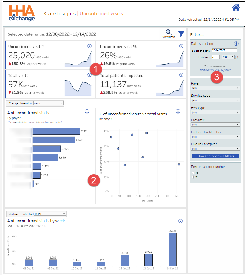
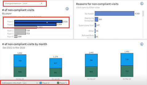
A Dashboard is made up of cards (top left, 1) presenting high-level informational charts, interactive cards called widgets (bottom, 2) where the user can customize (Change Dimension, Add Payers to) the chart rather than changing all displayed charts, and filters (right, 3) that can be used to change the content of all the cards and widgets.
![]() At top right of each Dashboard is a Home icon that the user can click to return to the Homepage.
At top right of each Dashboard is a Home icon that the user can click to return to the Homepage.
![]() Above the widgets near top right is the View Data (magnifying glass) icon that the user can click to display the source data for the Dashboard. For more information on viewing data, see the View Data section later in this topic.
Above the widgets near top right is the View Data (magnifying glass) icon that the user can click to display the source data for the Dashboard. For more information on viewing data, see the View Data section later in this topic.
 Next to the View Data icon is the Display/Hide Filters (funnel) icon that the user can click to hide the Filters pane and allow more screen space for viewing widgets.

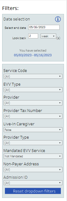
The Filters pane (on the right) gives users the ability to select the data they want to see in cards and widgets.
Some unique features of the Filters pane are explained in the following table.
|
Feature |
Definition |
|---|---|
|
Date Selection |
To set a date range, the user enters a Select end date and specifies the number of days, weeks, months, quarters, or years that the Dashboard should Look Back. The actual dates selected are displayed at the bottom of the Date Selection pane. In the Billing Dashboard, the user can also filter by Date Type – Invoice or Visit. |
| Non-Payer Address | Used to identify when the Visit Address differs from the Payer's record of the Patient Address. |
|
Reset Dropdown Filters |
When the user clicks Reset Dropdown Filters, all the filter dropdown values are returned to the default All setting. |
|
Percentage or Number |
On some dashboards, the user can select to view results by Percentage (%) or by Number (#). Switching between Percentage and Number may change the type of chart displayed. When Percentage is selected, the user can specify a Target Percentage to display as a dashed line on the chart for comparison with actual results. For example, a target could be set at 70% for EVV Non-Compliance. |
|
EVV Visits by Type |
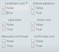
On the EVV Total Visits dashboard, the user can determine what Visit Types are analyzed by selecting False and True values. For example, when False and True are both selected for Compliant visit, all Visits are analyzed regardless of Compliance status. When only True is selected, only Compliant Visits are analyzed. When only False is selected, only Non-Compliant Visits are analyzed. All Visit Types are included by default. Users must deselect False and True values to obtain customized results. |

Widgets are the interactive cards where users can filter chart data for analysis.
Some unique features of widgets are explained in the following table.
|
Feature |
Definition |
|---|---|
|
Change Dimension |
Users can change the dimension (focus) of all displayed widgets by selecting from the Change dimension list in the top left widget. For example, the dimension can be changed from Payer to Caregiver. |
|
Select Elements to Filter |
Users can select one or more (CTRL + click) lines or bars in the chart to filter by just those elements. For example, in the sample above, Payers 2 and 5 are selected, so only data from those two Payers is analyzed. |
|
Add (Payers/Providers) into Chart |
Users can add specific Payers or Providers (depending on the Dashboard) to a widget by selecting them from the Add (Payers/Providers) into Chart list in the bottom widget. |

![]() Above the widget near the top right of the Dashboard is the View Data (magnifying glass) icon that the user can click to display the source data for the dashboard.
Above the widget near the top right of the Dashboard is the View Data (magnifying glass) icon that the user can click to display the source data for the dashboard.
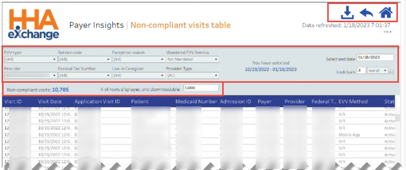
The user can view all data for the Dashboard or select one or more (CTRL + click) specific lines or bars in a chart before clicking the View Data icon to see data for just those specific elements.
Filter options are available across the top of the View Data page columns.
Below the Filter options, the total number of rows is displayed. By default, only the first 1,000 rows are displayed and downloadable. Users can change the # of rows displayed and downloadable to any positive number.
The following icons are available at top right of the page:
![]() Users can click the Download icon to export the displayed data in CSV or Microsoft Excel format.
Users can click the Download icon to export the displayed data in CSV or Microsoft Excel format.
![]() Users can click the Return icon (back arrow) to return to the Dashboard.
Users can click the Return icon (back arrow) to return to the Dashboard.
![]() Users can click the Home icon to return to the Dashboard Homepage.
Users can click the Home icon to return to the Dashboard Homepage.
